This is just a quick update to an earlier blog. In The question of skies I asked whether or not users of Photos4artists would like to see skies in the galleries. This is just a quick update to assure those who said they would, that skies are being added as and when the grey disappears.
As well as photos included in the miscellaneous galleries in photos4artists, a gallery dedicated to skies can be found at http://www.freedigitalimages.co.uk/Skies.html. It's early days, but I can assure you that many photos will be added over the coming months.
.
Saturday, 20 March 2010
The Shadows
Nothing is more frustrating than stepping back to view your finished painting (when it's dried of course) and realising that you have failed to achieve a satisfactory sense of depth.
I think I've already mentioned the beauty of the foreground shadow in pushing back the horizon. Another way to achieve the same effect is to paint in a dark cloud(s) overhead.
An often made error when painting shadow is forgetting to maintain your tonal values. It's so easy to use the same well of paint for all your shadows, with the result that distant shadows dry as dark as your foreground shadows. Adding water will lessen the strength, but wouldn't adding a cool or warm colour depending where you put the shadow look so much better.
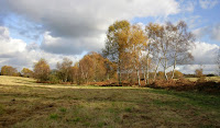 In the photo on the right you will see that the shadow of the line of ferns is by far the darkest. Note the horizontal line of shadow running from the ferns to the left side. You don't need to start with your darkest tone at the very bottom. Any darker or warmer object or line near to the bottom of your picture (your foreground) will help you achieve a sense of depth.
One last point: photos don't always show shadows as being lighter as they recede. The camera is infinitely better at capturing a scene than we are, so we can be sure that they probably do. It's just that we aren't able to grasp such a small shift in the tone. To be certain your viewers do see and appreciate this change in your painting it might be necessary to exaggerate the tone in your shadows.
ps Thanks for pointing out the typo, John. I've corrected it now (and given this post a slight rewrite). I can't see for looking sometimes, so if you see any more please let me know.
Tuesday, 2 March 2010
Keeping perspective in perspective
What is perspective?
In simple terms, perspective provides various ways for an artist to create the illusion of depth on an otherwise one dimensional surface.
Aerial perspective, a term first coined by Leonardo da Vinci describes the act of recession. Colour fades and contrast weakens the further away the object. It's nothing we didn't already know, but sometimes we need to be reminded.
A camp fire at its height will appear red, yellow or orange, but most of all it will appear warm. As the fire dies the colours fade and eventually all that remains is grey or white ash. Basically no colour at all. Now imagine sitting in front of that fire. It will feel hot - let's face it, the hotter it is the closer it will feel. Stay in the same place and when the fire has died and cooled and it will seem much further away.
Let's translate this into art . . .
Sunday, 28 February 2010
Focus on your centre of interest
Unless very abstract every painting would benefit from a focal point or centre of interest. The trick is make sure your chosen focal point doesn't melt into the backround.

In many pictures the focal point will be obvious. It's probably why you chose that particular subject to paint. Take the photo on the left: what else apart from the rowing boats could you choose as your focal point?
Losing one boat to avoid competition or toning down the colours on the lighter boat to lessen the rivalry might help. It's your decision.
Losing one boat to avoid competition or toning down the colours on the lighter boat to lessen the rivalry might help. It's your decision.
 The fishing boat on the right sits in the centre and is clearly the focal point, but could you improve the emphasis?
 Saturday, 27 February 2010
Make your colours work for you
What is colour and how does it affect your painting?
There is no simple answer. Remove the colour and obviously all that remains is a black, white and grey image. Is that a limited palette? Probably not. You'd have little more than a tonal sketch and unless you were famous and probably dead your painting with have little value. Black and white or sepia might work in photography, but probably not in a painting.
Don't reject the limited palette though. Mixing a greater or lesser amount of just two or three colours
in most or all of your strokes or washes creates harmony. Choose transparent, not opaque colour and you will also avoid mud and produce a refreshing and vibrant work of art.
in most or all of your strokes or washes creates harmony. Choose transparent, not opaque colour and you will also avoid mud and produce a refreshing and vibrant work of art.
Colour creates mood. We all know that warm colours are uplifting and that cool colours are melancholic, but there's much more to producing mood than plastering on a wash of red or blue. For instance, is a predominantly cool painting with a splash of warmth a cool painting? Not necessarily. The final result depends on so many aspects. But what is true is that you are unlikely to achieve your intended effect unless you have planned your colour scheme first.
Friday, 26 February 2010
It's not just wine in Burgundy
You don't need to be a Francophile to love Burgundy. Think rural England with sunshine and you are halfway to knowing Burgundy.

Calais to Troyes is just 250 miles and will take about four hours on roads England can only dream about. You'll have to pay a toll to travel on the A26 peage, but for a relaxed and relatively traffic free journey it's money well spent.
You won't be too thrilled with the scenery until you reach Troyes as there isn't really much to distinguish it from any run of the mill scenery anywhere else. Best to close your eyes and wait until Troyes before forming an opinion.

Three into One does go
Apart from clarity and detail high resolution photos have another distinct advantage over smaller images and that is the ability to find another painting opportunity within the same photo.

Crop a smaller image and all you have left is one that's even smaller and might as well be viewed through frosted glass. Clearly not every photo offers the opportunity for a multiple crop, but plenty do. This photo of a manor house in Burgundy is an example of one that does. The original photo has good composition; the darker yet smaller tower in the middle providing the balance for the larger but lighter building on the right. And when you have exhausted your creative juices with your own rendition of a photo why not see if you can paint another similar, yet different picture.
Subscribe to:
Posts (Atom)